Posts

Magazine Inner Advert - Progression
Image
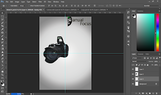
I have begun production of my competition page of my magazine. Here I have added a radial white and grey background. I have used white and grey to show purity and truthfulness. I have also added in the logo and camera image I wanted in my sketches. I have also used guidelines to help me correctly position my images to be in-line. The next step is to add images and text into the page. I also need to ask my peers for feedback. I have successfully added images onto the page as I noted in the previous step and am about to begin typing details of the competition. I have faded them into each other to help put more images into one space by neatly overlapping them. After asking my peers about the first steps of my magazine's page the main feedback was that my logo had to be on the opposing side. This did not only look better but also applied to continuity theory (gestalt principle). This means that the reader automatically looks at the top left corner, which in this case sees the mag

Magazine Back Page - Progression

Image
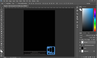
Here is the first stage of my production for my back cover. Here, I have already come up with a logo and brand name for my advertisement. Following my sketches I have made, I have designed the layout and contents following them. The background has also been taken into consideration following my sketches. The terms and conditions of creating advertisements have been added to the bottom of the page, as is usually seen on adverts (or small print is shown). However, there is a lot of negative space between the top of the logo and the T&C area. This needs to be fixed with either text or and new arrangement of the layout. In response to the problem I faced about the negative space in Stage 1, I have added a grey background to that entire area. This is so that it shows that it is a different section of the advert (information). I have added in a persuasive description of the brand. This is so that the reader understands the brand better and knows what the brand sells. The terms and

Magazine Double Page Spread - Progression

Image
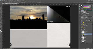
Upon looking at my sketches, the layout of the images does not appear to be professionally thought out. So, after conducting further research into photography magazine articles, I had chosen this layout for my magazine's double page spread. I have added in all the main images at the top and added a light grey box for the text. I have also added in page numbers, which is an essential part of the codes and convention of magazines. Following on from the previous step, I have added in text to the page, as is needed in an article. I have positioned the title to the article in a large Serif font. This is so that it stands out from the rest of the page and is the first thing they see (following continuity theory; Gestalt principle). I have also put the font in a yellow colour so that it contrasts well with the black background image to again, attract attention to that area. The main article's test is in progress of being typed and is written in columns, as my research of the co

Magazine Contents Page - Progression

Image
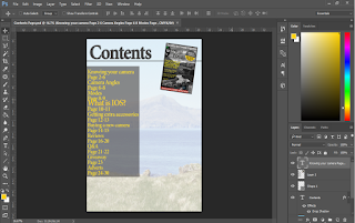
The first stage of creating my contents page is to add in a background. However, if the background was a a picture, it would stand out too much from the rest of the page and would interfere too much with the readability. Following the codes and convention of photography magazine contents pages, I have kept the page listings and numbers at the left side of the page, this is so that it follows the continuity theory of reading left to right, top to bottom. I have also put an image of the magazine's front cover. This is so that it fills up any negative space within that area. I have used a Serif font because it follows the typography scheme of my magazine. In this stage, I have added credential information box in the bottom corner. This is because according to my research, I need to give credit to those who are involved in the making of the magazine. However, in my case, I am the only one who is involved in the production of the magazine. I have used a Serif font here as this app

Magazine Front Cover - Progression

Image
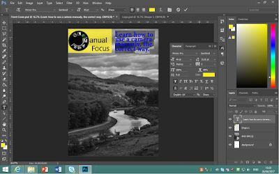
Here, I have just started production and have added appropriate background and the sketched logo for my magazine (with background). Here, I am currently editing the text that will be the 'Main Cover line'. This needs to be clear and bold as this will tell the reader the best thing about the magazine. Here I have changed my ideas on the layout and logo of my magazine's front cover. This is because it took up too much room and did not follow the codes and convention of typical magazines well. So instead, I cropped the logo down to a more manageable size and moved the main cover line down to the left hand side, where it will follow the continuity theory better. However, I still have the problem of negative space in the top right corner and needs to be solved. Now I have added more text into the magazine to fill the space on the left with colours and fonts I wanted to use in my sketches. I have also looked back on magazine front covers and found that many of them hav

Action Plan for FMP (Pre/Mid/Post) Production

Link: Click here to view Action Plan